Point Delivery - Your Trusted Delivery Company
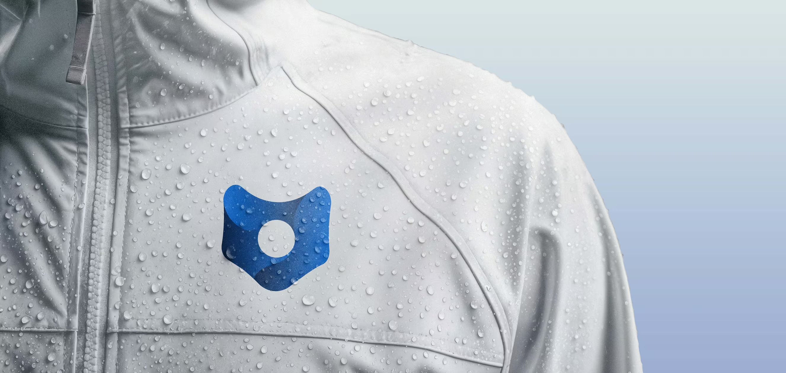
This logo is a conceptual redesign of the visual identity for Point Delivery, a logistics company. The client requested a minimal symbol reflecting integrity, speed, and professionalism, while preserving key elements of the original identity - namely the Oswald typeface and the signature blue (#448afe). The solution is designed for broad application, from office materials to packaging and delivery vehicles.

I began the process by exploring associations typical for companies of this kind, and then moved on to combining those elements - both with each other and with typography.

The final solution combines a location marker, symbolizing precision - with a box, referencing package delivery. I kept the original brand’s colour and typography, adjusting the font weight to bold and introducing a gradient of two shades of blue to convey dynamism and professionalism.
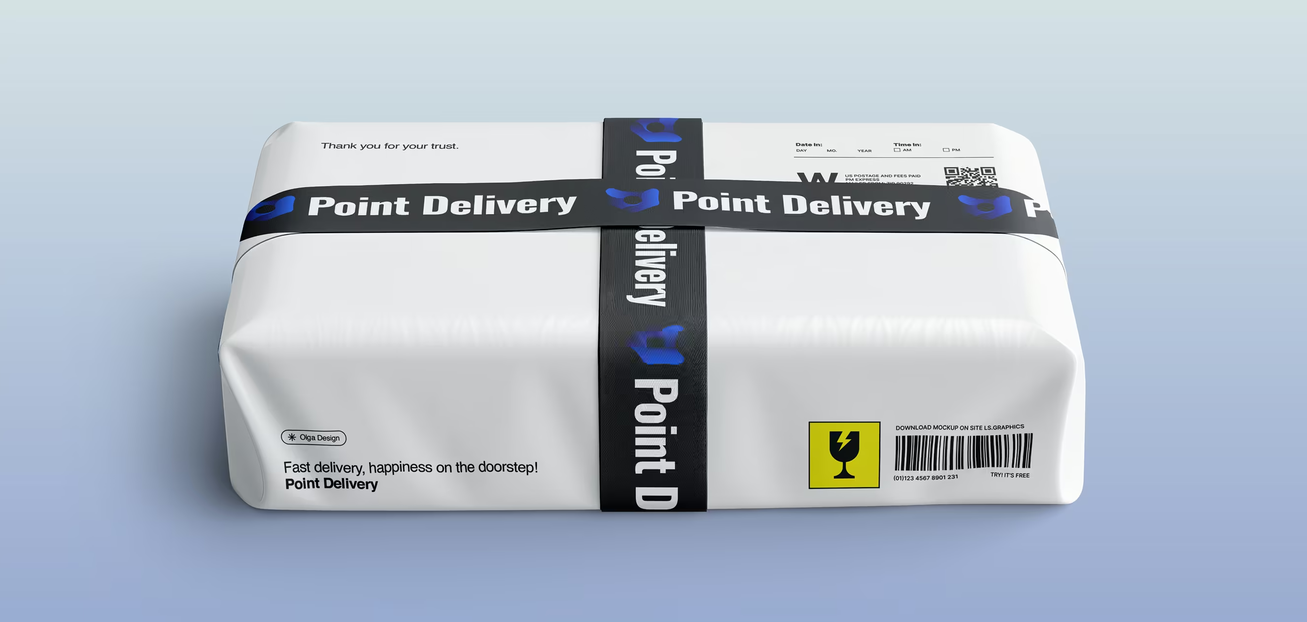
Below, you can see how the design is applied across various business-related promotional materials, addressing the key requirement emphasized in the initial brief.