Pawker - Connecting Paws With Purpose
Pawker is an application designed to improve pet care by connecting pet owners who lack the time to fully dedicate themselves to their pets with animal lovers who are unable to have pets of their own but would enjoy spending more time with them. The development of this project includes the entire process of creating a digital product - from market research and user testing to designing the application itself.
The first step involved defining the problem, goals, and expectations. It became clear that the app should address issues such as insufficient physical activity for pets, as well as reduce frustration and guilt experienced by both groups of users. Through a series of interviews, I identified an audience within our region that would be interested in an application of this type. In addition to interviews, a detailed analysis of competitors and existing solutions helped shape a clearer vision of the desired look and functionality.
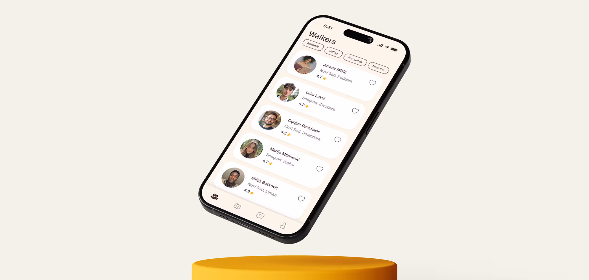
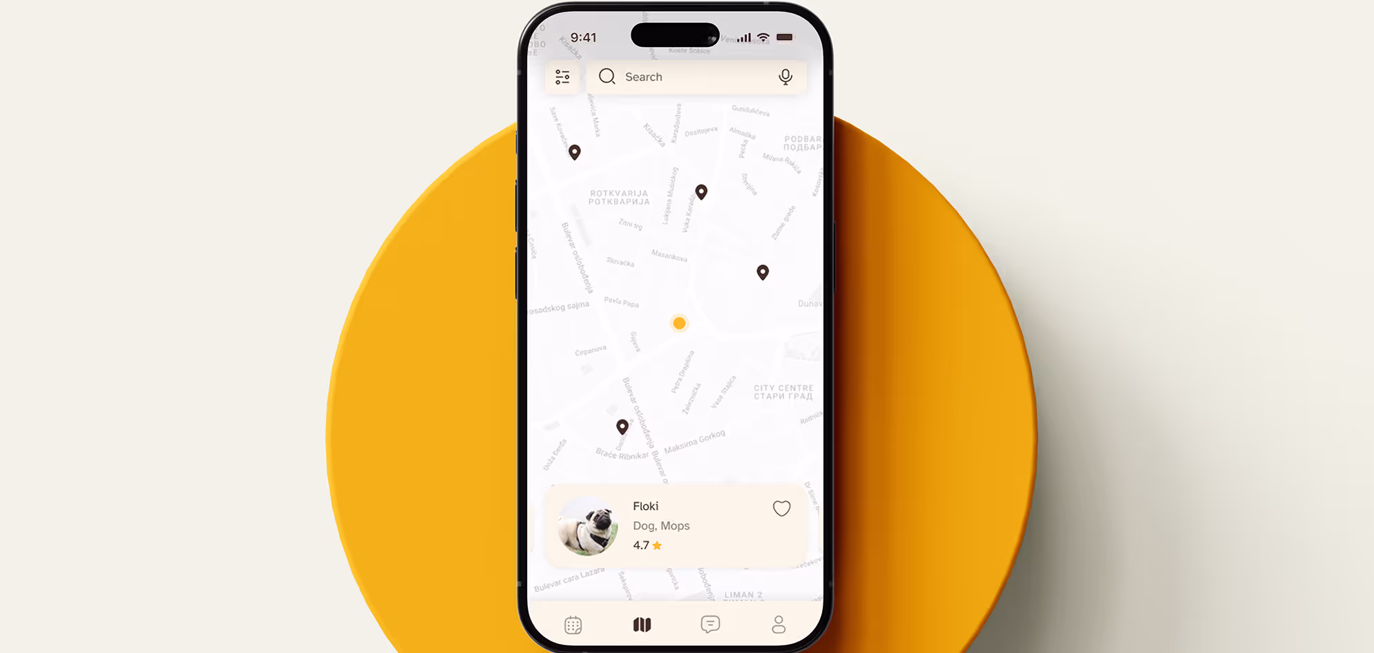
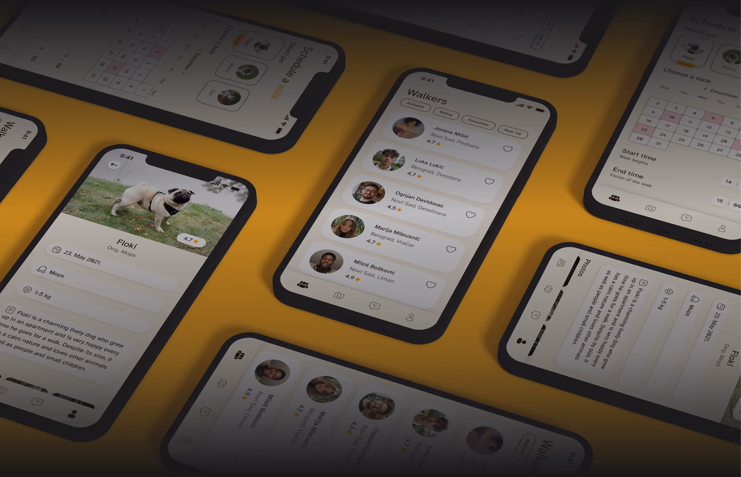
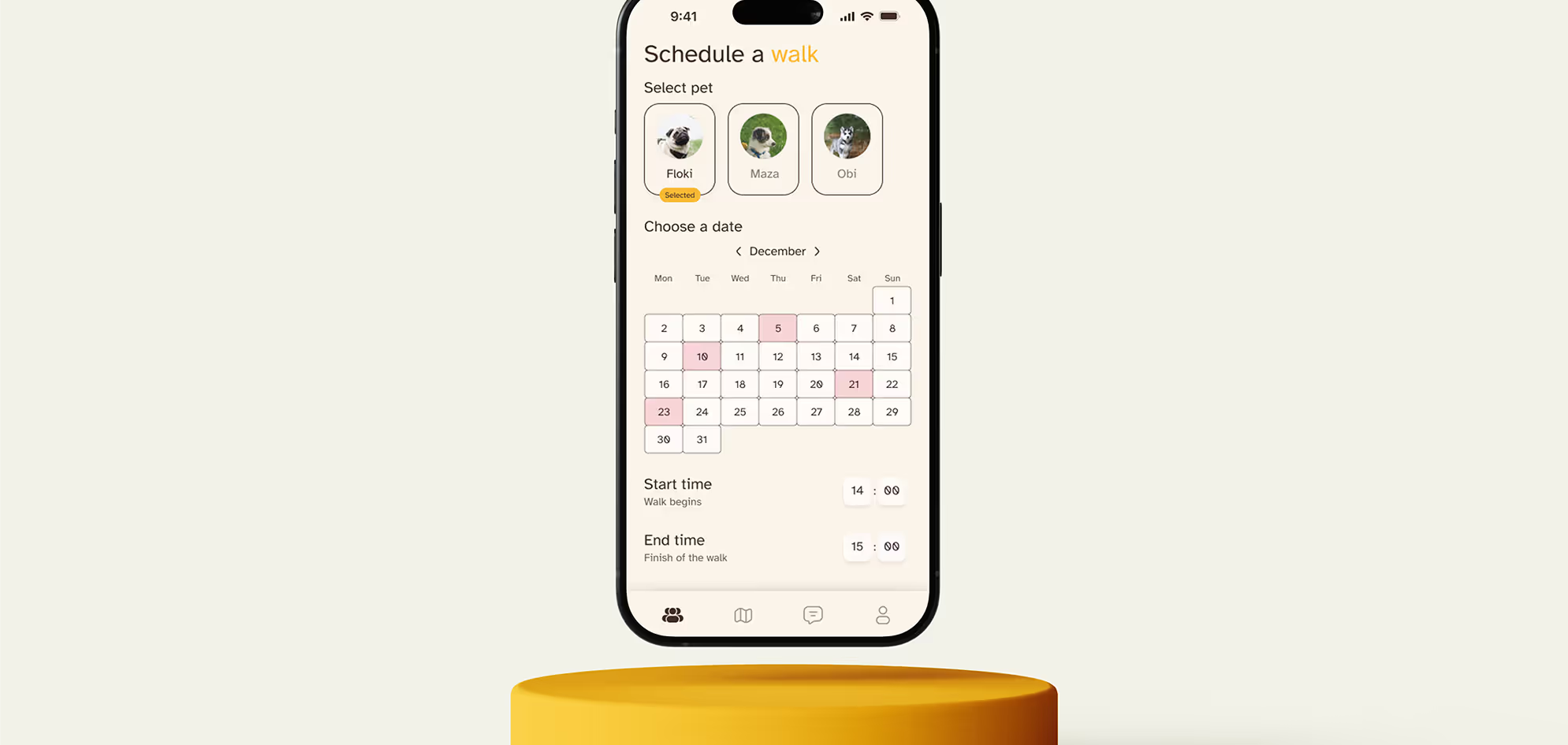
I noticed that current solutions lack features such as real-time pet walk tracking, as well as messaging and call capabilities. Therefore, I decided to include these as key functionalities. Furthermore, existing interfaces are not well-adapted to all user groups (particularly older users), so I addressed this by carefully selecting appropriate colors and element sizes to ensure better accessibility.
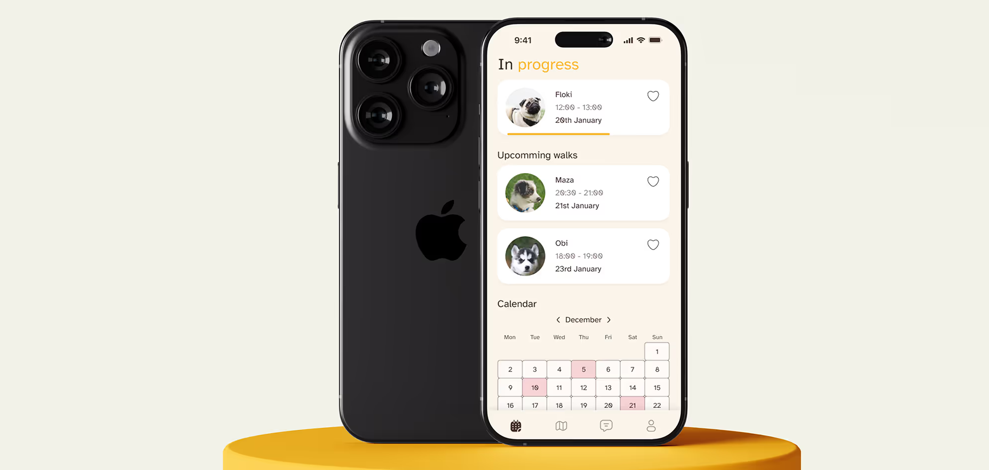
To gain a deeper understanding of the diverse needs of potential users, I created user personas and user scenarios. These tools helped illustrate how the app could bring value to various types of users. After that, I built a moodboard and developed a user flow to ensure intuitive and clear navigation throughout the app. The final stage involved designing a clickable high-fidelity wireframe.
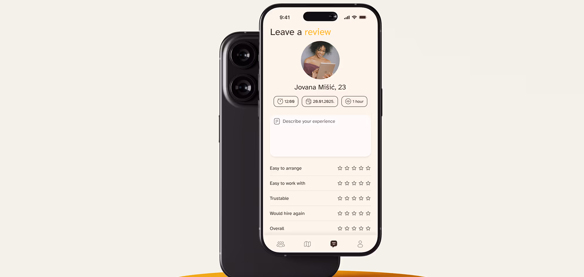
For the visual identity, I chose a soft beige (#FAF3E8) as the primary color, a deep brown (#331B17) as the secondary, and a warm yellow (#F8B421) as an accent color. This palette creates a relaxed and welcoming atmosphere, further enhanced by the use of the Atkinson Hyperlegible font - modern, yet highly readable and accessible.